


Effective gift offer UI design is not just a decorative element; it is a powerful strategic tool that can significantly reduce cart abandonment and boost average order value. Best Practices for displaying free gifts revolve around integrating the offer seamlessly into the customer journey. It begins on product pages, sparking desire, and becomes most critical in the cart—the final stage of decision-making.
A successful free gift display in ecommerce is transparent, motivational, and visually appealing, instantly answering the customer’s core questions: “What is the gift?”, “How do I get it?”, and “What is it worth?”.
Fortunately, implementing these UI/UX Techniques for highlighting gift offers in cart and product pages has been made accessible for WooCommerce store owners through the free gifts for WooCommerce plugin.
Let’s review how to use these powerful techniques to transform a simple promotion into a compelling reason to buy, fostering customer loyalty and driving tangible growth for your business.
Understanding User Behavior: Why Free Gifts Drive Conversions
The power of a free gift in e-commerce is deeply rooted in fundamental principles of human psychology and behavioral economics. It’s far more than just a simple discount; it’s a strategic tool that, when executed well, taps into core motivations that drive purchasing decisions.
Read More: Why Do Free Gifts Boost Sales? A Deep Dive into Consumer Psychology
The primary reason free gifts are so effective is their ability to leverage the principle of reciprocity. When a customer perceives that a store is giving them something valuable for free, they feel a subconscious urge to reciprocate the kind gesture. This often translates into completing a purchase that might have been abandoned otherwise. A well-executed free gift display in e-commerce capitalizes on this feeling, creating a positive emotional connection with the brand.
Furthermore, free gifts effectively combat loss aversion—the idea that people prefer to avoid losing something they already have rather than acquiring something new. Once a customer qualifies for a gift, it becomes theirs in their mind.
The gift offer UI design plays a critical role here. Highlighting gift offers in the cart with a message like “You’ve earned this gift!” triggers the fear of missing out (FOMO) if they don’t complete the checkout. This makes abandoning the cart feel like an actual loss, powerfully incentivizing them to finalize the sale.
This is where the art of displaying free gifts UI/UX becomes paramount. The offer must be clear, visually appealing, and seamlessly integrated into the shopping journey. Poor gift offer UI design, such as hiding the offer in the footer or using unclear text, completely negates these psychological benefits. The customer must instantly understand:
- What the gift is (using high-quality images)?
- How close are they to unlocking it (using a dynamic progress bar)?
- The value they’re receiving (showing the “original price”)?
By mastering the best practices for displaying free gifts—from a prominent product page announcement to a compelling cart highlight—you don’t just offer a product; you offer an enhanced, psychologically rewarding experience that directly drives conversions and builds lasting loyalty.
Best Practices for Displaying Conversions
Here are a few key strategies you can implement to transform a simple offer into a powerful conversion tool that delights your customers and drives growth.
Visual Elements: Badges, Popups, Banners, and Icons
Strategic use of visual elements is crucial for effective free gift promotion. A well-designed badge using contrasting colors and clear icons like 🎁 instantly draws attention to the offer.
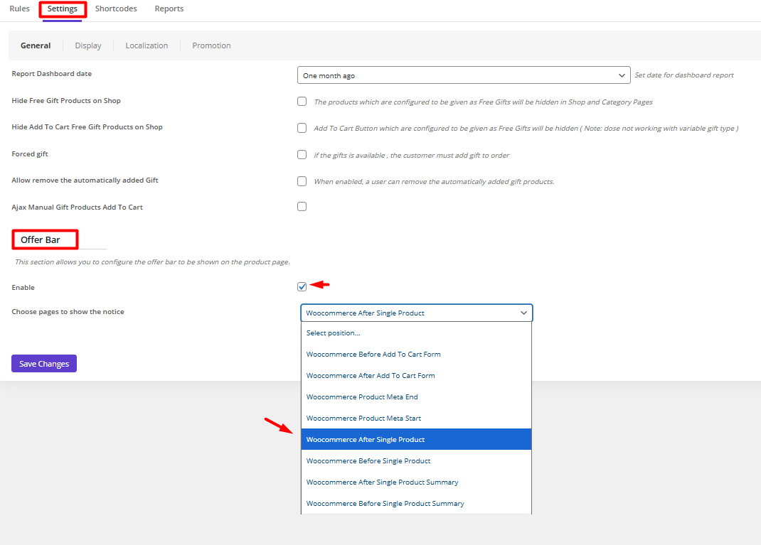
Plugin setup
Free gifts for WooCommerce plugin allow you to easily customize the offer bar in the product page or the cart page.
To customize gift offer UI design, try to:
- Go to Settings > General.
- Scroll down to see the Offer Bar section.
- Mark Enable.
- Open the drop-down list of Choose pages to display the notice.
- Choose where to show the notice in the Product page.
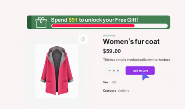
Progress bars with dynamic visuals create a sense of achievement, showing customers how close they are to unlocking their reward.
Plugin setup
If you set up a Subtotal rule to offer free gifts to your customers, it is possible to add a progress bar for highlighting gift offers in the cart or product page by following the steps below:
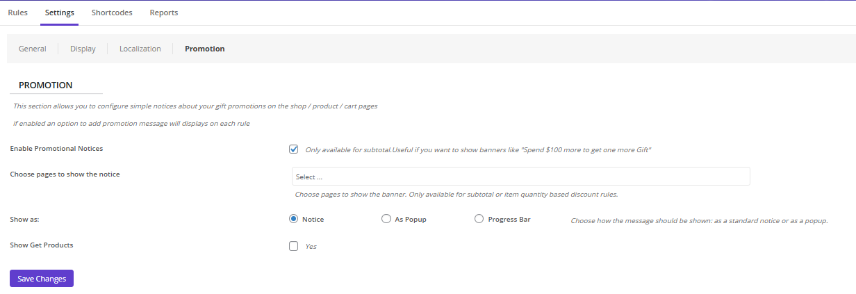
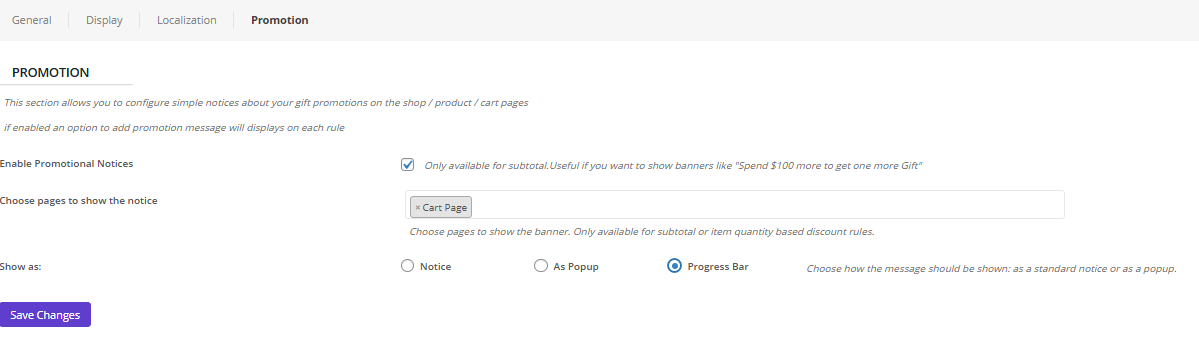
Step 1: Enable Promotions
- Go to Settings > Promotions.
- Mark Enable promotional notices.
- Choose pages to show the notice (e.g. Cart, Product, Checkout, …)
- Configure the gift offer UI design: Notice, Popup, Progress Bar
- Mark Show Get Products if you want to display the gifts to the customers.
For example, you can set the Progress bar displayed on the Cart page.
Step 2: Customize the promotion
To customize the promotion, you need to add a subtotal rule and scroll down to see the Promotion Message section.
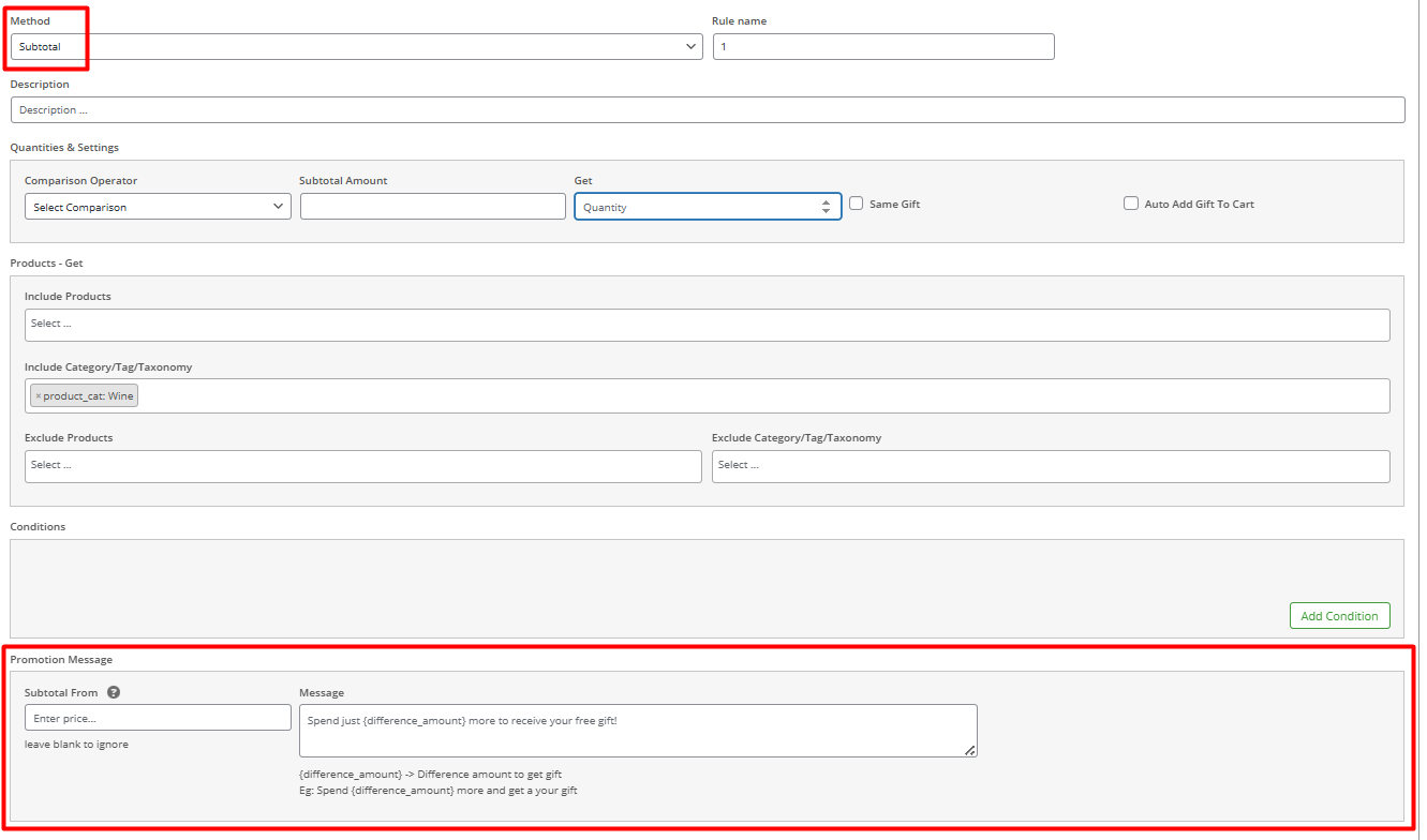
In this section, you can set the following:
- Subtotal from: Set a limit to display the promotion.
- Massage: Write your preferred message to display in the selected page. You can use place holders like {difference_amount} to let customers know how far they are to be eligible for the free gift.
For qualified offers, a celebratory pop-up with smooth animation creates positive feedback, while persistent banners maintain top-of-mind awareness throughout the shopping journey.
Plugin setup
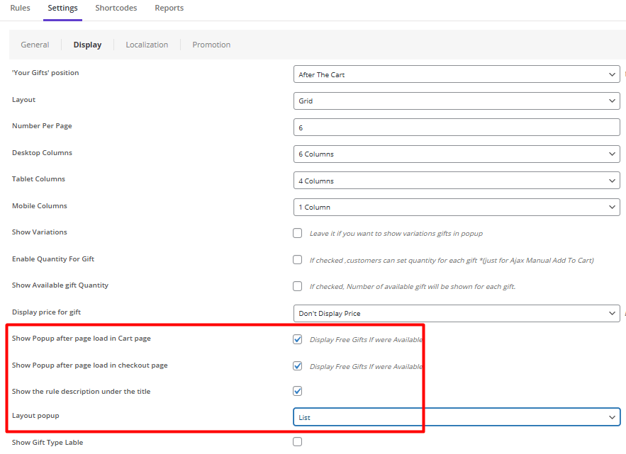
For highlighting gift offers in the cart by displaying an appealing pop-up, try to:
- Open the Display format in the Settings.
- Scroll down the form and mark one (or both) of the following items:
- Show pop-up in the cart Page.
- Show pop-up in the checkout page.
- Open the Pop-up Layout dropdown list and choose the gift offer UI design of the pop-up as List or Carousel.
These elements work together to transform ordinary promotions into engaging visual experiences that drive conversions and enhance customer satisfaction.
GIFTiT – Free Gifts For WooCommerce
The smart way to highlight free gifts and boost conversions in WooCommerce
Clarity and Transparency: Communicating Gift Eligibility and Criteria
The foundation of any successful gift promotion is absolute clarity. Customers must instantly understand what the gift is, its value, and exactly how to qualify for it. Avoid vague phrases like “special offer” and instead use explicit copy such as “Spend $50, Get a Free Water Bottle.”
Clearly state any restrictions, like applicable product categories or time limits, directly next to the offer. This transparency builds trust, manages expectations, and prevents frustration at checkout, ensuring the promotion enhances the experience rather than creating doubt.
The best practices for displaying free gift offers with clarity include:
- Site-wide Header Bar: A fixed banner at the top of every page with clear text, e.g., “Free Gift on Orders Over $50!”
- Homepage Banner: A prominent hero banner or section featuring an image of the free gift and the offer details.
- Product Pages: A clear message near the “Add to Cart” button, e.g., “Add to cart to claim your free gift!”
- Shopping Cart Page: A progress bar or text message showing the amount left to spend to qualify for the gift.
- Checkout Page: A dedicated line item in the order summary confirming the free gift has been added with a value of $0.00.
- Exit-Intent Popup: A pop-up that appears when a user is about to leave the site, reminding them of the offer.
- Social Media Channels: Posts and stories featuring a high-quality image of the gift and a link to the promotion’s terms.
- Marketing Emails: A dedicated email campaign or a section in a newsletter announcing the free gift offer.
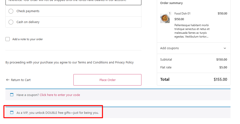
For example, you can follow the steps below to display a notice in the checkout page:
- Go to Settings > Display.
- Mark Display notice in the checkout page.
- Write your message in the Free gift notice box.
- Press Save Settings.
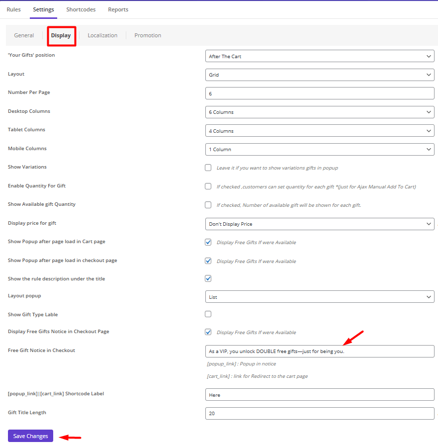
This is how customers can see your notification:
A/B Testing Gift Offer Presentations: What Works Best?
Never assume you know the most effective way to present your gift offer; always let data guide your decisions. A/B testing allows you to experiment with different variables to see what truly resonates with your audience. Test different placements (e.g., near the add-to-cart button vs. in the cart sidebar), wording (“Free Gift” vs. “Bonus”), colors, and the use of progress bars or gift imagery. You might discover that a specific call-to-action increases your average order value or that a particular visual style significantly reduces cart abandonment, allowing you to optimize your strategy based on real user behavior.
Where to Showcase Gift Offers: Product Page vs. Cart Page
Choosing the right location to promote your free gift offer is crucial. Each page serves a different purpose in the customer journey and influences behavior in a unique way. The best practices for displaying free gifts often involve using both pages in a strategic sequence to maximize impact.
The following table breaks down the key differences, objectives, and gift offer UI design considerations for each location.
| Aspect | Product Page | Cart Page |
|---|---|---|
| Primary Goal | To inspire and motivate the initial add-to-cart action. | To reinforce the decision and prevent cart abandonment. |
| User Mindset | Browsing, comparing, evaluating. | Committing, reviewing, preparing to checkout. |
| Best For | Lower-value thresholds or gifts tied to a specific product. | Higher cart-value thresholds or site-wide promotions. |
| UI/UX Focus | Displaying free gift UI/UX that creates desire. Use attractive gift imagery near the “Add to Cart” button. | Highlighting gift offers that emphasize achievement. Use a progress bar or a prominent “You’ve Earned a Gift!” banner. |
| Psychological Trigger | Aspiration & Incentive: “I want that gift, so I’ll add this to my cart.” | Loss Aversion & Urgency: “I’ve already earned this gift; I don’t want to lose it.” |
| Key Advantage | Increases Average Order Value (AOV) by encouraging customers to add more items to reach the threshold. | Dramatically reduces cart abandonment by providing a powerful last-minute reason to complete the purchase. |
| Example Implementation | A message under the price: “Add $25 more to receive a free gift!” | A visual alert in the cart: “You’re $10 away from a free gift! Add something now!” |
Best UI/UX Practices for Highlighting Free Gifts on Product Pages
Everyone loves getting something for free. But if your customer misses the offer, it’s like it never existed. The trick to displaying free gifts effectively on a product page is all about catching their eye at the exact moment they’re making a decision—without getting in their way. It’s a balance of excitement and clarity.
Here’s what works well:
1. Place it Where the Eyes Are
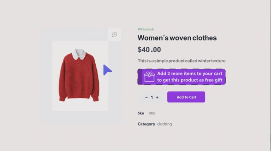
Near the “Add to Cart” Button. This is prime real estate. Your customer, looking at the button, is already thinking, “Should I buy this?” Seeing a gift offer right there can be the final little push they need.
A simple, clean badge or a short line of text like, “Add to Cart & Get a Free Scrunchie!” works wonders.
This is the core of good gift offer UI design—it’s helpful, not annoying.
2. Be Crystal Clear (No Guesswork!)
Ambiguity is the killer of conversions. Never use vague text like “Special Offer Inside.” Be specific. Tell them exactly what they get and what they need to do.
- Good: “Free Water Bottle with any purchase over $50!”
- Bad: “Free Gift with Purchase!”
This clarity is the most important part of your free gift display in ecommerce. Customers should never have to play detective to understand your promotion.
3. Show Off the Gift with an Image
Text is good, but a picture is far more powerful. If you can, use a small, high-quality thumbnail image of the actual gift next to the offer text. A picture makes the gift feel real and tangible, instantly increasing its perceived value and desirability.
Effective Techniques for Showcasing Gifts in Cart Pages
Use a Persistent Cart Summary Banner
A top technique for highlighting gift offers in the cart is a fixed banner at the top of the page. This banner should visually celebrate the customer’s achievement—e.g., “You’ve unlocked a FREE gift!”—or show progress toward one.
This persistent reminder reinforces the reward’s value and keeps the incentive visible throughout the cart review process, reducing abandonment and encouraging completion of the purchase.
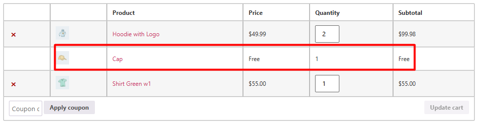
Display the Gift Visually in the Item List
Incorporate the gift directly into the cart’s item list as a “free item” with a prominent price tag of $0.00. This gift offer UI design tactic makes the gift feel like a tangible part of the order, not just a promotion. It enhances perceived value and helps customers mentally “claim” the gift, making them less likely to remove items and lose the bonus.
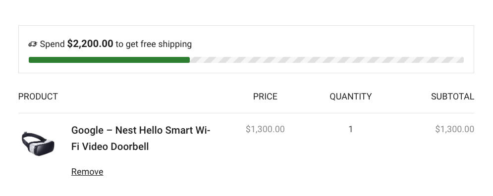
Implement a Progress Bar with Clear Call-to-Action
A dynamic progress bar is a cornerstone of displaying free gifts UI/UX in the cart. It visually indicates how close the customer is to unlocking the offer—e.g., “Just $10 away from your free gift!”—and can be paired with a button linking to best-selling products. This not only motivates higher spending but also simplifies the path to completing the requirement, aligning with best practices for displaying free gifts.
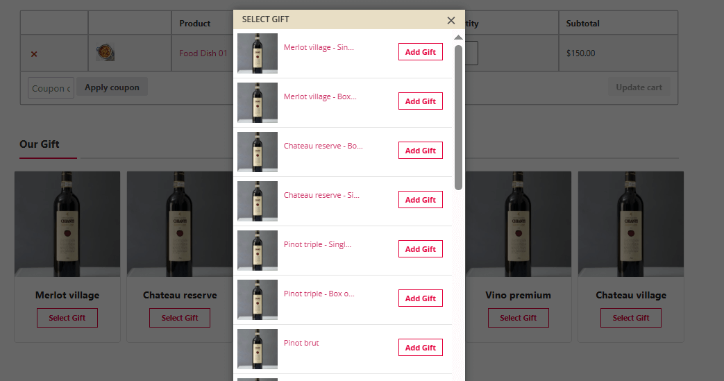
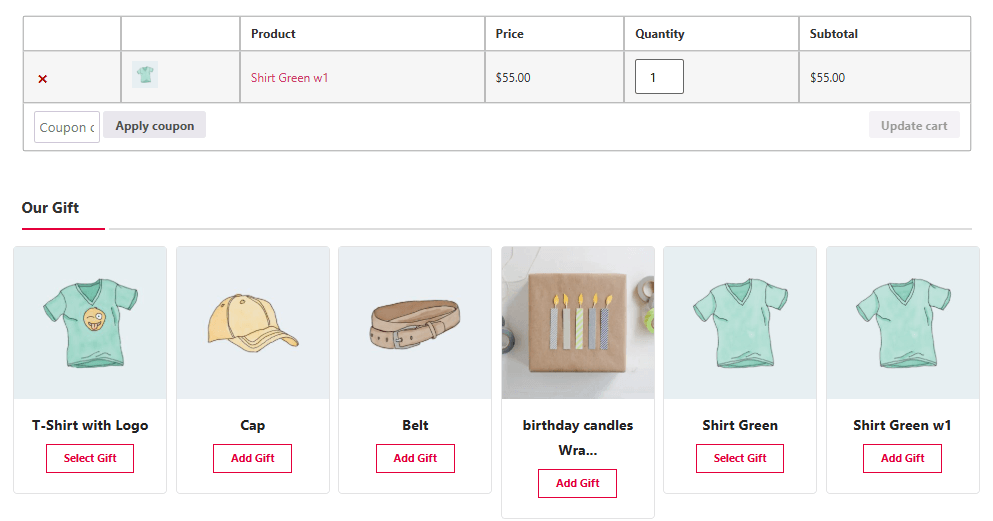
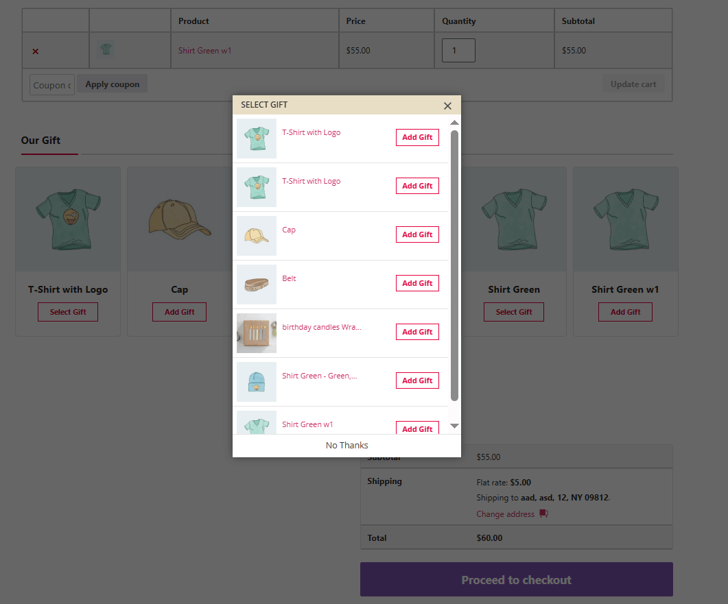
Showcase a Gift Selection Grid
For promotions with multiple gift options, elevate your free gift display in e-commerce by showcasing the choices in an attractive image grid. This visual gallery allows customers to see all available gifts, making the offer feel more substantial and desirable. It transforms the promotion from a simple text message into an engaging experience that increases perceived value and customer excitement.
Confirm with a Celebratory Pop-up
A powerful method for highlighting gift offers in the cart begins with a confirmation pop-up. Immediately after a customer adds a qualifying item, a small pop-up should appear to celebrate that they’ve unlocked a free gift. This creates a moment of delight and positive reinforcement, making the gift feel earned and significantly reducing the likelihood of cart abandonment.
Common Mistakes to Avoid When Displaying Gift Offers
Many businesses undermine their gift promotions by making critical errors that confuse or frustrate customers.
The most common mistake is a lack of clarity, using vague language like “Special Offer” instead of explicitly stating what the gift is and the exact threshold to qualify.
Another major error is poor visibility, hiding the offer in the website footer or cart sidebar, where it is easily missed.
Additionally, failing to properly display the gift in the cart or not automatically applying it at checkout creates a broken experience that can lead to immediate abandonment.
Finally, not optimizing the offer for mobile devices ensures a significant portion of your audience will have a subpar experience.
Case Studies: E-commerce Brands Excelling at Free Gift Presentation
The following case studies showcase best practices for displaying free gifts, with real examples of displaying free gifts UI/UX, highlighting gift offers in cart, and effective free gift display ecommerce.
| Brand / Site | What they display and where (with image/banner etc.) | Notes on UI/UX & Free Gift Presentation | Source |
|---|---|---|---|
| Ulta Beauty | They have a “Gifts with Purchase” section in their navigation, where free gift offers are shown as product + gift combos; also product pages show “Free Gift with purchase” labels. | Good example of highlighting gift offers in cart & free gift display ecommerce: customers can clearly see which items are eligible, images of gift sets, “Add to Bag” buttons show gift-offer text. | Ultra Beauty |
| Sephora | They offer a Birthday Gift page (“Get a FREE Birthday Gift Set… Spend $25+ …”) prominently shown; also “Beauty Offers” where free sample or gift offers are displayed as banners or sections. | Good displaying free gifts UI/UX: the free gift is visible before checkout, in offers or promos sections; the offer is visually laid out with image and condition (minimum spend etc). | Beauty Deals BFF+3Sephora |
GIFTiT – Free Gifts For WooCommerce
The smart way to highlight free gifts and boost conversions in WooCommerce
Summary: Key Takeaways for Superior Gift UI/UX
Effective gift promotion hinges on clarity, visibility, and seamless integration. Always prioritize transparent communication—explicitly state the gift, its value, and eligibility requirements to build trust and avoid confusion.
Strategically place offers near high-interaction areas like the “Add to Cart” button and cart page, using visual elements like badges, progress bars, and celebratory pop-ups to capture attention and reinforce value.
Ensure responsiveness across devices, and continuously refine your approach through A/B testing to align with user preferences.
By avoiding vague language, poor visibility, and technical flaws, you can transform gift offers into powerful tools for enhancing customer experience and driving conversions.
FAQ
Q: Why is it important to highlight free gifts in the cart and product pages?
A: Prominently displaying free gifts can increase user engagement, reduce cart abandonment, and boost conversion rates by adding perceived value to a purchase.
Q: What are the most effective UI/UX elements for displaying free gifts?
A: Badges, banners, pop-up notifications, and clear visual cues near the ‘Add to Cart’ and cart summary areas are among the most effective elements.
Q: How can I ensure customers understand how to qualify for a free gift?
A: Clearly communicate eligibility criteria using concise text, tooltips, and progress indicators, and reinforce it throughout the checkout process.
Q: Should free gift offers be different on mobile vs. desktop?
A: Yes, optimize for smaller screens by prioritizing clarity and minimizing distractions, using expandable sections or simplified banners when necessary.
Q: How do I measure the effectiveness of free gift UI implementations?
A: Use A/B testing, analyze conversion rate changes, monitor engagement with gift elements, and collect user feedback to gauge success.


