

A WooCommerce product table can make shopping much faster, but only if it works well on every device. Many customers browse online stores from mobile phones or tablets, and a product table with too many columns can quickly become hard to read, scroll, or use on smaller screens.
That is why creating a responsive WooCommerce product table is important. Instead of showing the same columns on desktop, tablet, and mobile, you can display the right product information for each device. For example, you may show image, title, price, quantity, and add-to-cart button on mobile, while showing more details like SKU, stock, attributes, or short description on desktop.
In this step-by-step guide, you’ll learn how to create a responsive product table in WooCommerce using TABLEiT – Product Table for WooCommerce. You’ll see how to customize table columns for different devices, improve the mobile shopping experience, and display products in a cleaner layout without writing code.
Mobile tables require different priorities from desktop layouts. Our responsive WooCommerce product table guide covers the wider UX, filtering, and ordering decisions.
Quick Answer:
A responsive WooCommerce product table helps customers browse, compare, filter, and add products to cart more easily on desktop, tablet, and mobile devices. The easiest no-code way to create this layout is using TABLEiT – Product Table for WooCommerce, which lets you build custom product tables with columns, filters, search boxes, pagination, and mobile-friendly display options.
After installing the plugin, go to WordPress Dashboard > iThemeland > TABLEiT and create a new product table. Use the Query settings to choose which products should appear, then open the Columns section to add fields such as product image, title, price, SKU, stock, quantity, and add-to-cart button. Finally, adjust the responsive and style settings so the table remains readable on smaller screens.
This approach is especially useful for stores with large catalogs, wholesale products, restaurant menus, spare parts, or any shop where customers need to compare several products quickly. TABLEiT plugin is more practical than the default WooCommerce grid because it gives store owners full control over table structure, customer navigation, and responsive product browsing in one interface.
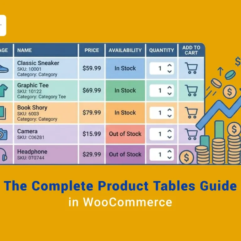
Create a responsive WooCommerce product table with different columns on each device with the WooCommerce product table plugin
WooCommerce product table plugin is a professional plugin that allows you to create attractive and advanced responsive product tables for your online shop. With the help of this plugin, you can create a list of your products in eye-catching and mobile-friendly tables with various features, such as the number of stock, price, size, color, etc., displayed in separate columns.
It is also possible to add various features such as sorting, search, and pagination to your product table with one click so that your customers can easily find and compare several products in one table and order them with the Add to Cart button directly from the table.
The tables you create with this WordPress responsive table plugin are displayed to your customers in a fully responsive and appropriate manner on all different devices, such as desktop, tablet, and mobile.
Here, you can find a step-by-step guide for creating mobile-friendly tables with this plugin.
TABLEiT – Product Table for WooCommerce
The easy way to create a responsive product table with different columns in WooCommerce

Step 1: Install and activate the WooCommerce product table plugin
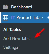
The first step to creating a responsive WooCommerce product table is to download and install the WooCommerce product table plugin. After the plugin activation, you need to go to the below address to open the Add New Table page:
WordPress Dashboard > iT Product Table > Add new table
Then, scroll down the page and click on the Get Start button to create a new table:
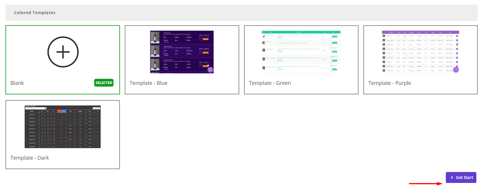
As soon as you create a new table, all of your WooCommerce products will be imported to the table automatically. However, if you want to customize the products displayed on the product table to your customers, you can go to the Query tab and make a new query.
Now, you are ready to create a responsive WooCommerce product table with different columns on mobile and other devices by proceeding to the next step.
Step 2: Add columns to the product table and create mobile responsive table
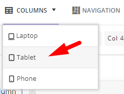
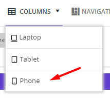
The WooCommerce product table plugin comes with a very handy interface. So, you can easily find the Columns tab on the top of the page. Before opening this tab to add the table columns, you need to choose one of the devices from the list:
- Laptop
- Tablet
- Phone
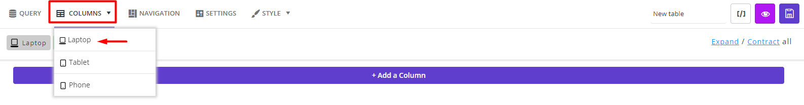
Don’t worry about customizing the columns on different devices. Later, we will show you how to import the columns from laptop to other devices.
So, to create a responsive product table, just choose laptop to see the Column page.
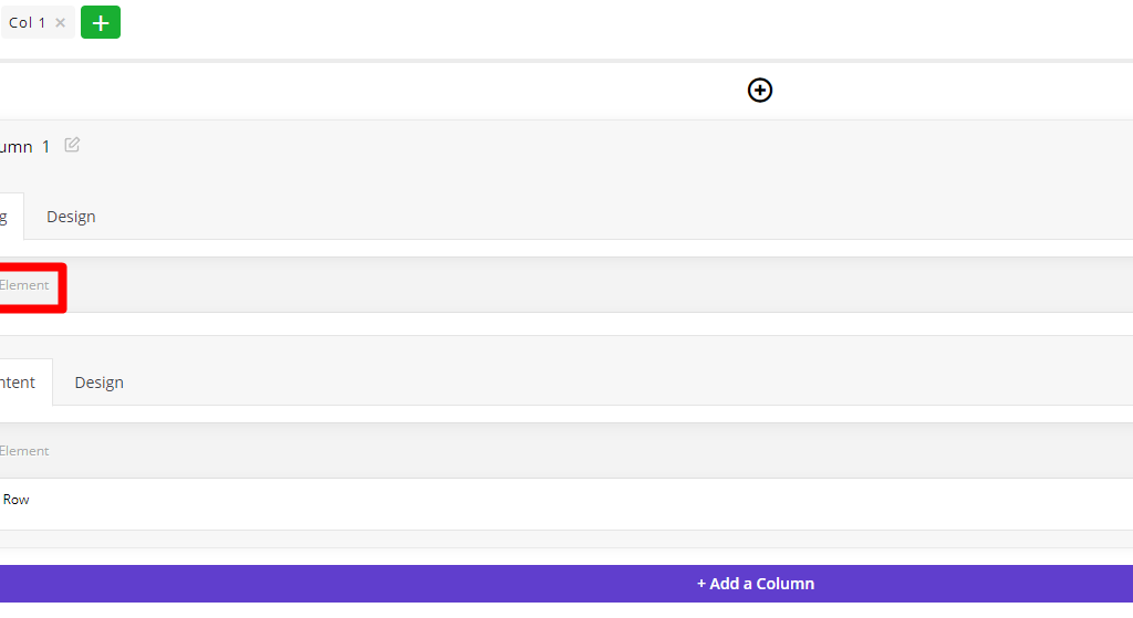
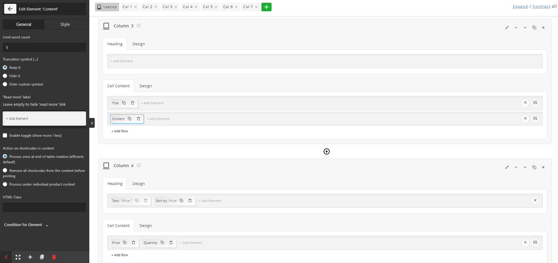
Here, you can find a big blue button which is really hard to ignore for adding a new column to your table. Simply click on it to see the new column box, which is divided into two sections:
- Heading: The title of the table column.
- Cell Content: The elements are displayed in each cell of the table column.
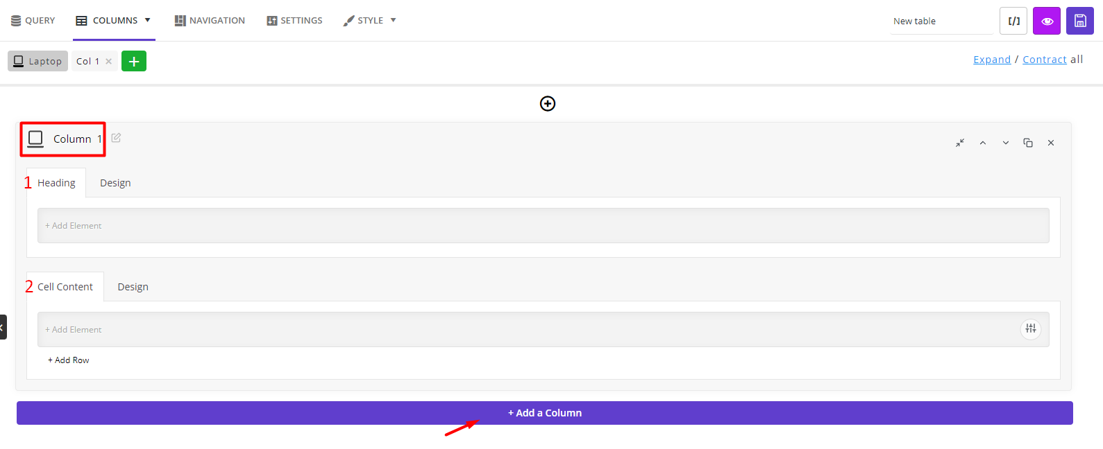
Let’s see how you can customize these sections with our plugin tools.
Customize product table heading
To show a title for the new table column, you need to press the Add Element button and choose one of the below elements from the list that just appeared in the left panel:
- Dot: To add “.” Between two elements in the column heading.
- HTML: Add an HTML code for the column heading.
- Icon: To add an icon to be displayed in the column heading.
- Media Image: Show an image to the customers in the column heading.
- Sorting: Add a sorting option to the column heading.
- Space: To add space between elements in the column heading.
- Text: Insert any title for the column heading.
- Tooltip: To show a tooltip for the column heading.
As soon as you add one of the elements, the Element Settings panel will be displayed to you in the left panel, including the below items:
- General
- Style
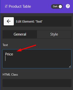
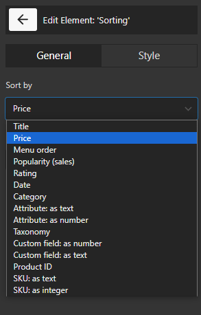
You can add more than one element in a heading to customize the title of the new column. For example, if you want to let customers sort the product based on the product price, try to:
- Press the Add Element option.
- Add Price from the Elements list.
- In the General tab, write Price in the box.
- Click on Add Element again.
- Choose Sorting from the list of elements.
- In the General tab, choose Price from the dropdown list of Sort by field.
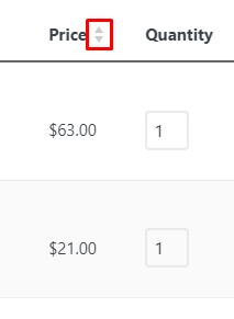
The result is like this:
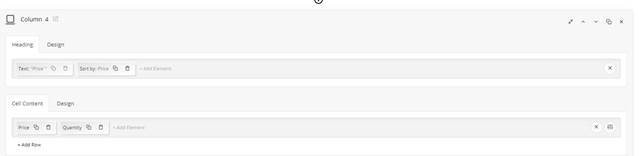
And this is what the heading looks like in your table:
Customize product table cell content
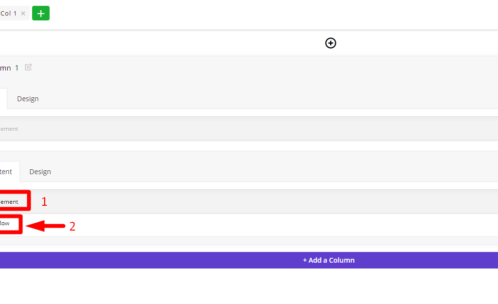
In the Cell Content box, you have two options:
- Add elements: By choosing this option, all elements available to be displayed in the product table columns are shown in the left panel. Just like the heading, you can choose one or more of them to be displayed in the cell and customize it by editing the items in the General and Style tab.
- Add row: To help you create a responsive product table with different columns, we designed the Add Row tool, allowing you to add as many rows as you need to one column of your table. Then, assign one or more elements to each row based on your needs.
By following the above instructions, you can show all WooCommerce fields to your customers in an eye-catching and mobile-friendly product table.
For example, we tried to add the below columns to our product table:
- Check box
- Image
- Content
- Price
- Quantity
- Color
- Size
To see how the product table look like on the laptop, press the Preview icon on the top right corner of the page:
If everything looks good, you can proceed to the next step of creating a responsive product table
Step 3: Create mobile-friendly product tables
To create a table for mobile or tablet, click on the Columns tab again and choose one of the options other than laptop. In this tutorial, we first try the Phone option and then the Tablet, but there is no difference in which one you choose first.
Create a responsive product table for tablet devices
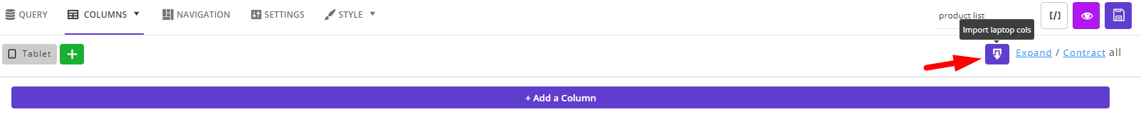
The tools you have for creating tables responsive for tablet is the same as the Laptop option except for an Import tool allowing you to copy all columns from the Laptop to the Tablet page.
To use these tools for designing a responsive WooCommerce product table for tablets, You just need to choose Tablet from the list of Columns tab.
Then choose the Import button if you want to copy all columns from the Laptop view to the Tablet view.
Then you can edit the columns, remove or rearrange them by using the icons designed in the column box:
It is also possible to add a new column by pressing the related button.
After changing and arranging the columns, you can see a preview to make sure everything is perfect.
We will make some examples in the next section to show you how easy it is to create and customize responsive product tables in our plugin.
Customize responsive product table for mobile devices
After choosing the Phone option, the plugin will lead you to a new page which is almost the same as the laptop column page.
On this page, you have two options for creating WooCommerce products’ mobile view columns.
- Import laptop columns to create a responsive table mobile
To import columns from the Laptop view, click on the Import icon on the top right corner of the screen. Then wait a few seconds and let the plugin show all the columns that you have already added to the Laptop view, here.
Now, you can customize imported columns to create a responsive table for mobile by using one of the below options:
- Remove, copy, or rearrange the columns by pressing the related icon on the right corner of each column box as illustrated below:
- Remove rows or rearrange them by pressing the related icon in front of each row as shown below:
For example, we remove the Content row from the mobile view to make our WooCommerce product table more mobile-friendly.
- Add new columns to the product table on the mobile device
You can add new columns between the previous columns by pressing the + icon displayed among them or press Add a Column button to add a new column at the end.

When the customization suits your needs, you can click on the eye icon to see a preview of your product table for mobile.

Step 4: Use Shortcode to display mobile responsive table to customers
Displaying the responsive WooCommerce product table on your website is an easy task by following the instructions below:
- Write a name for your product table and save it.
- Press the Shortcode icon to copy.
- Go to the WordPress > Pages and add a new page.
- Paste the shortcode on the page and publish the page.
That’s it. You can now let customers visit the page on each device and review the products in a responsive table for mobile and desktop.
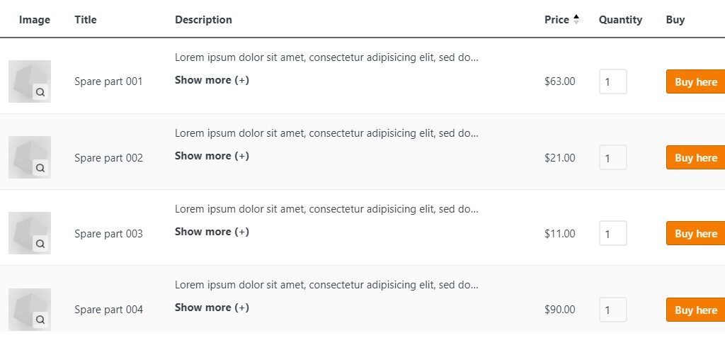
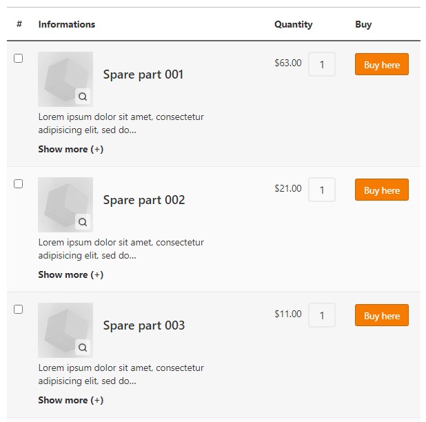
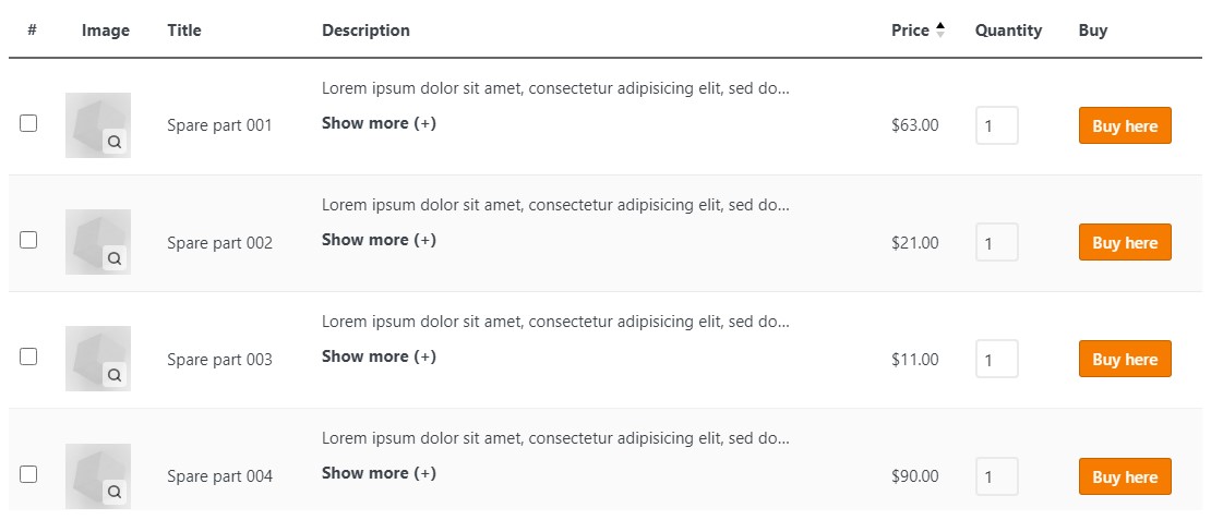
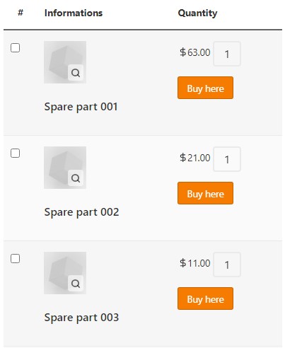
In the following images, you can observe the output of our example in each device:
WooCommerce products desktop view 👇
WooCommerce products mobile view👇
TABLEiT – Product Table for WooCommerce
The easy way to create a responsive product table with different columns in WooCommerce
Conclusion
A responsive WooCommerce product table helps customers browse, compare, and buy products more easily on desktop, tablet, and mobile devices. Instead of forcing the same table layout everywhere, you can choose which columns appear on each screen size and make the shopping experience cleaner for every user.
For desktop users, you can show more product details such as image, price, stock, attributes, quantity, and add-to-cart options. For mobile users, you can keep the table simple by showing only the most important columns, so customers can view products and complete their purchase without frustration.
With TABLEiT – Product Table for WooCommerce, you can create device-specific product tables, customize columns for laptop, tablet, and phone views, add search and sorting options, and publish the table with a shortcode. This makes it easier to build a mobile-friendly WooCommerce store that is both practical for customers and easier to manage for store owners.
After simplifying the mobile columns, test search, quantity controls, and cart actions on real devices. Use this broader mobile-commerce resource as a checklist.
FAQ
1. What is a responsive WooCommerce product table?
A responsive WooCommerce product table is a product table that adjusts its layout for different devices, such as desktop, tablet, and mobile. It helps customers view product details clearly without struggling with broken columns or difficult scrolling.
2. Why is a mobile-friendly product table important in WooCommerce?
A mobile-friendly product table improves the shopping experience for customers who visit your store from smartphones. If the table is too wide or crowded, users may leave the page before adding products to the cart.
3. Can I show different product columns on mobile and desktop?
Yes. With TABLEiT, you can create different column layouts for desktop, tablet, and mobile. This lets you show more details on larger screens and keep the mobile table simple.
4. What columns should I show in a mobile WooCommerce product table?
For mobile views, it is usually better to show only essential columns such as product image, title, price, quantity, and add-to-cart button. Extra details can be removed or moved to desktop/tablet views.
5. Can I add search and sorting to a responsive product table?
Yes. Search and sorting options help customers find products faster, especially when your table includes many items. These features are useful for large catalogs, wholesale stores, food ordering, spare parts, and product comparison pages.
6. Do I need coding to create a responsive WooCommerce product table?
No. TABLEiT lets you build responsive product tables from the plugin interface. You can customize columns, preview different device views, and display the table using a shortcode.
7. Is a responsive product table useful for stores with many products?
Yes. A responsive product table is especially useful for stores with many products because it helps customers compare items, check prices, choose quantities, and add products to the cart faster from one page.